Showing posts with label paintings. Show all posts

Tuesday, February 21, 2023

New Arrangements

Something fell into my lap last year that I hadn't been looking for; but I knew when I saw it that I wanted it.  For the last few years I have been trying to simplify my life and here was something that might work.  There are so many things I do, things that I do and enjoy doing, but I struggle to stuff them into the few short hours of every day.  

Up until now, I have always had 3 or 4 galleries showing my work.  From the early 80's when I went to Toronto and met up with the formidable gallerist Miriam Shiell; and through the years when I connected at the Emma Lake Workshops with the brilliant artist Robert Christie and his gallery at that time, Art Placement in Saskatoon; and then there was John Long of the Wade Gallery who took my paintings to Los Angeles.  That is only the beginning of the great galleries that I have been lucky to be shown by.  They were artists and dealers who loved art and worked in a difficult business to introduce me to the world.  

Because I have had the luxury of being able to go to my studio every day, I have always had paintings galore to show.  That is not the problem  The problem is selecting shows, sending jpegs out, keeping in touch with the galleries, packing paintings to be delivered to the galleries, and so on.  Lots to do.  

When Oeno Gallery made the suggestion that I show with them exclusively, I was very ready to listen.  This would be simpler.  Rather than having work all over the place, and losing track of it, and forgetting about it for a while;  I could focus on the one relationship and be on top of what is happening.

And that is what we have been doing for a while now.  It is going very well.  In fact, it is going so well, that there is only one hang up - I am busier than ever.  

Here is a photo of me relaxing at the Sandbanks in Prince Edward County, which is where the Oeno Gallery is located.


Monday, June 06, 2022

On the Question of Changing Your Style


                        Photo from 'A Life of Picasso The Minotaur Years, 1933-1943' by John Richardson


I was so surprised to see that these portraits of a woman's head (I forget which one it was, maybe Dora Maar) were both painted in 1939.  Look how different they are!  One is a somewhat realistic depiction of a woman with a cute green hat.  We would know who it is if it were a friend.  The other one however is a strange contortion of a head and body, sort of surrealist, and only the people on the inside know who it is intended to be.


Many times I am chastising myself because I keep changing my 'style', if you can call it that.  I go back and forth from a more realistic depiction of a landscape to a minimalist abstraction with only a few clues as to what it is.  For instance, here is a lake that I painted inn 1999:


Chaperon's Lake, 38x54", 1999.

You can see it is sort of an impressionist lake scene with shrubs and bushes in the foreground, then the water of the lake and the view across it.  However, here is another lake that I painted in 1988:


Lake Shapes, 40x50", 1988.

It is so different. There was time to change because they were painted 10 years apart.  But Chaperon's Lake is more similar to the work I did in the 80's when I was first starting out; and Lake Shapes is hinting at what I went on to paint in the early 2000's.  I guess I sometimes I have to remind myself that I can still do something, to reassure myself that I am still me.  And it is actually really boring if you are just repeating yourself.  When you are in your studio regularly you have lots of ideas and you want to try them all.  Many famous artists do it with no qualms at all.  Look at Gerard Richter - his two different styles are extremely apart from each other, all abstract to photographic reality.  


Friday, February 11, 2022

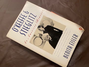
O'Keeffe & Stieglitz An American Romance by Benita Eisler

For the past month or so, I have been quite entertained by this biography. Written in 1992, it is full of endless details and sometimes cutting comments about the subjects' behaviour.


Because Steiglitz had his renowned gallery 291 and later The Place, Alfred and Georgia knew and interacted with many artists, collectors, critics and society figures.  The names are so familiar:  Charles Demuth, Ansel Adams, Paul Strand, Florine Stettheimer, Mabel Dodge Luhan, it goes on and on; they seemed to know everybody, wealthy and not.  

One artist that I was inspired by, John Marin, was a good friend of theirs.  I always wanted to see more of the actual paintings and drawings that he created; they were full of energy and life.  But it was curious to hear about him as a human being with the flaws and ups and downs in his relationship with them.


O'Keefe and Stieglitz were brilliant artists, and brilliant marketers, but they were not brilliant in interacting with each other or with their friends.  Living at a time when people wrote letters, there is quite a record of their thoughts and behaviours, not only through their own letters but also through the letters of others.  The author doesn't hesitate to note how nasty and even cruel they could be, the both of them, on occasion when interacting with each other and their friends and acquaintances.

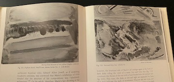
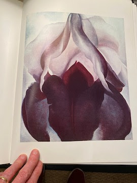
While reading, I dug out an old coffee table book that had reproductions of Georgia's work.  I hadn't really looked at any of her paintings for a long time.  What surprised me was that I liked them more than I remembered; but however I was unsettled that my recent floral inspirations may have been influenced by what I saw so many years ago.  

Georgia O'Keeffe, 'Black Iris', 36x30", 1926


Me, 'Canna Lily', 42x42", 2019


They worked hard, all their life, and saw the rewards for that, Georgia more than Alfred at the end.  When he died, he was quite hard up.  Georgia being younger had more time to produce paintings and lived long enough to become a very rich woman.  


Monday, November 09, 2020

Painting in a Pandemic


 Lately people have been asking if I am still painting.  The world has been in turmoil for a while now, however most of us artists just carry on as usual.  We go to our studios and pick up a paintbrush or whatever is our favourite tool. 

After I sent my paintings to Newzones Gallery in Calgary for my landscape show in March (yes, that March and no I wasn’t able to attend the opening), I returned to a series that I had started in 2019.  The subject is something new for me, or new/old.  Years ago I painted flowers, flowers by themselves or flowers in still lifes.  I had some success with those paintings and was very happy with them.  Eventually though I decided that I couldn’t compete with nature, nature had more sophisticated tools than I had, and I turned aside from that challenge.


It seems that this past decade of exploring colour – and simplifying detail to do so – has somehow led me full circle, however. Looking for a new starting point I started tentatively thinking of flowers again. In the same way that I had simplified the landscape, I saw how the flowers could be a beginning. This wouldn’t be an attempt at verisimilitude; this series isn’t really ‘of’ flowers.  The flowers with their radiance and intensity initiate the act of putting paint on canvas but they don’t control the result. The result has more to do with the curious act of ‘painting’, playing with hue, surface texture and markmaking.


You can see Neil Wedman's essay in my previous post.  He explains it much better than I can do.


Sunday, November 08, 2020

Neil Wedman Essay

Pat Service's Flowers

The subject of flowers is, in every sense, central to the new series of paintings by Pat Service.  Departing only slightly from her almost constant concern with depicting broader aspects of the landscape, Service has made an abundant sequence of square canvases, in sizes ranging from 20 x 20 inches to 42 x 42 inches, each holding, at its centre, identifiable portrait of a single blossom. Detached from stem, leaves or even a background shade, each unique flower head appears, greatly magnified, like a target, flattened and alone within a square frame, the arrangement reading like a hypnotic spiral analogous to the actual formation of a blossom in nature.


These bold flower paintings seize and touch the viewer in an instant, in a way that only a painted picture can do and, of course, further unhurried inspection reveals a richness at the heart of the thing. Each represents a different botanical specimen presumably based on a real life sample but it is clear that realist portrayal is not at issue here. Pat Service is merely an admirer of natural bouquets not an expert horticulturalist. All the same, like all of Service’s work, The Flower Paintings find origin in the surroundings of her life and observations but interpretively expand upon the dull limits of outward appearances. Only the small circles, signifying pistils, anchoring each floral shape at its centre have a peculiar exactness intimating a notion of plant science but ultimately make no concession to accuracy or illusionism. From painting to painting, each monochrome palette varies hues that are only casually attendant to the natural spectrum. Mainly the paint is applied on its own terms abjuring the contours and folds faithful to delicate petals in favour of examining the plain and uncomplicated contour of a flat canvas. Thinly, I think, at first and never awfully thick, a loose but solid wash forms the general silhouette of each bloom over which short, sturdy, brusque strokes of the same colour introduce textures and nuanced, layered tones pushing the colour to the edges of the petals, ragged in places with the unfussy dragging of a dry brush. Around the outside contours of each posy is a thin strip of raw, un-primed canvas like an outline separating the spectacular, large flower from the surrounding negative space remaining in the frame. The negative space is painted white, titanium white, making the lack of spatial definition a deliberate and integral element of the composition, the thin border of ivory white, unpainted canvas left around the flower describes the line of an invisible drawing.


The tradition of floral painting and its connotations for the cycles of life, domestic comfort and ephemeral glory reaches back to the ancient world. It also drags disparaging associations of a dainty banality, a cloying impression of amateur crowd pleasing so-called feminine art. At a glance, Pat Service’s flowers can remind a viewer of the particularly delicate, somewhat Victorian custom of pressed flowers but in another glance, this bold art bears a stronger and favourable comparison to Andy Warhol’s 1964 Flower Paintings. To my mind, the similarities are most obvious in the square formats used by the two artists and in the matter-of-fact flat applications of vivid colours often incongruous to the shared floral subject.  Of course, Warhol’s flowers are silkscreened from a found magazine image and Service has painted hers by hand but there is a clearly generic character to either series. Neither Andy Warhol’s or Pat Service’s versions of this subject are really about flowers.  This work concerns the vital act of portrayal, of working paint and colour and form to render a familiar theme in an unfamiliar way and convey the essence and ordinariness of beauty.


NW 

October 2020       


Neil Wedman


Wednesday, January 11, 2017

Voices from the Past

Occasionally I will receive a message from someone who has owned a painting of mine for a very long time and they tell me how much they love it.  Twice in the last month I have had such a pick-me-up.

This is one:


     "Switchback View", 46 x 66 inches, acrylic, 1989.

Here is the other:

     "Winter Pass", 36 x 48 inches, acrylic, 1986.

It is extremely rewarding when that happens.


Monday, March 21, 2016

Going Somewhere?

Although we haven't been in each others' studio for many years, it is curious that my friend Loraine Stephanson and I are both putting roads in our paintings. Roads are something I used to ignore because they seemed hard to integrate into the composition and also because they are man-made, uninteresting.  Now roads are almost central to the painting.  Here are two small paintings from a few years ago, while the two bigger ones that you can't see properly are from this year. Sorry that they are upside down and partially out of the picture.


Saturday, December 19, 2015

Cheap Brushes

These are the cheap brushes that I use for mixing my colours.  I put some paint into a container and use a plastic spoon or a little whisk to get started, but in the end I grab a brush like this because it does the job so well.  Recently I realized I could actually apply the paint to the canvas with them also.  However, there is no pleasure in the application; it is quite scratchy and rough.  A good brush with good bristles slides over the canvas in a luscious way.    


Thursday, September 17, 2015

'Round About Midnight' Exhibition

I am off to Calgary for the opening of my show there on Saturday (September 19, 2015) at Newzones Gallery of Contemporary Art.  The paintings are not of any particular place; they are more about memories of different occasions and moments.  However, it is hard for me to believe when I first visited this particular lake in Northern Saskatchewan what it would be the start of:


Thursday, April 09, 2015

The Magpie by Monet

People often have a mistaken idea about the life painters lead.  This is pointed out by Jeffrey Meyers in The New Criterion of March 2015.


Writing about the beautiful painting The Magpie by Monet, Jeffrey Meyers points out that the usual romantic descriptions of this painting are not anywhere near the truth.  Suffering through an extremely cold winter in 1868-9, Monet and his family lived in extreme poverty.  Despite the harsh conditions, he still went out to paint and was to be seen clothed in many overcoats, gloves and with a heater by his side.  This beautiful painting that he managed to create out of such hardship was rejected by the Official Salon of 1869.  The critics wax on poetically about the subtle effects of  the colour on the snow, but they ignore the ominous presence of the blackbird and what it portends.
Jeffrey Meyers Article on The Magpie

Tuesday, February 17, 2015

Some of Lorna's Picks

Recently I invited myself over to a friend's apartment because she told me she had hung one of my paintings and was very pleased with the way it looked.  I was surprised to see how many pieces she has collected from me over the years.  There were quite a few still lives, two of them from the 'Studio Picnics' series, such as this one:


The painting she was so excited about was her most recent purchase from my 'Dock' series, and I had to admit it looked very happy where she has hung it:


I started the Dock series in 2009, whereas the Studio Picnics are from the late 1980's.  Lorna has been a loyal fan.
  

Tuesday, November 04, 2014

Paintings Placed at U.B.C. Pharmaceutical Building

Three of my paintings have been placed in the  Pharmaceutical Sciences building at the University of British Columbia.  The very clean and uncluttered design of the interior of this new building is a good fit for the paintings.


The paintings seemed large in my studio, but the grandness of the scale of these spaces rather dwarfs them.  I am really happy to have them in such a compatible setting.

Thursday, March 06, 2014

Slide Show of Thirty Years of Painting

When researching a selection of paintings for my retrospective at The Evergreen Centre in Coquitlam (opening March 6, 2014 until April 17, 2014), it was difficult to choose which paintings would represent the course of my work.  We selected 16 large canvases which was about right for the exhibition space.  To provide a wider overview,  I put together a slide show with some insight into the fact that you never escape yourself.  The first slide is from 1977 and the last one is from 2013.  Here is the link:  "Painting This Place"

Friday, January 18, 2013

Exhibition at The Reach, Abbotsford

Next week my paintings will be in an exhibition at The Reach Gallery Museum in Abbotsford.  Called "Nests and Trees", this is a two-artist show of Vicky Marshall's 'nest' paintings and my 'trees'.  Curator Scott Marsden notes our 'explorations of minimalism and abstraction' while using nature as a reference point.  Here are three of my contributions to the show:

"Take Me"  70x66 inches  2012 

"Minder"  70x66 inches  2012

"Five Trees"  70x66 inches  2012

Tuesday, January 15, 2013

"New Beginnings" Group Exhibition

I just learned that one of my paintings is presently on exhibition in the small gallery at Art Placement in Saskatoon.  The company is excellent:  William Perehudoff, Jonathan Forrest, and Lorenzo Dupuis.  This is how we look:


Thanks to the powers to be at Art Placement for including me.

Thursday, June 28, 2012

Van Gogh: Up Close

I am looking forward to seeing this exhibition in Ottawa later this summer.  Organized by both The National Gallery and the Philadelphia Museum, it opened in Philadelphia in the spring and Karen Wilkin writes in The New Criterion that, despite all we have already seen and heard,  there is indeed still something to learn about van Gogh.  She writes:  "...a visually arresting van Gogh exhibition that makes us consider his work in new ways, introduces unfamiliar works and even helps us to see familiar ones with unjaded eyes."  I enjoy Karen's many ways of describing the works, such as 'a dense silt of dabs and dots", " a near monochrome of bleached green", or "insistent gatherings of slender touches'.
Karen Wilkin's Review    Van Gogh: Up Close, National Gallery of Canada   Since I have not yet seen the show, I don't know what is in it, but here is one of van Gogh's commanding works:


Thursday, May 31, 2012

National Portrait Gallery, Edinburgh

When I was in Edinburgh this month, I went to the National Portrait Gallery, which has just re-opened after a major renovation.  There are some very modern exhibition spaces now, as well as some of the more traditional galleries that have been retained.  It is quite stunning.

Amongst the many old-fashioned (boring?) portraits there are some recent ones that are very refreshing.  Ken Currie painted "The Oncologists" in a serious way.  And there is a lively painting of Peter Higgs by Lady Lucinda Mackay that  I liked very much.  When I told an old friend about it at dinner that night, she said, 'Oh, we have two sketches by her."  I see that the writer Alexander McCall Smith dedicated his novel "44 Scotland Street" to her.

There is much to explore in the old/new museum and I hope to have more time on my next visit to Scotland.


Tuesday, May 01, 2012

Do You Throw Out Old Paintings?

Last summer I went through some paintings from the 90's and with the help of my granddaughter, I made decisions about which to keep and which to destroy.  That went along very well, until one morning I woke up and realized with a sinking feeling that I had thrown out a painting that I really liked.  "Throwing out" means cutting it up into small pieces and putting it out into the garbage.

My friend Bob has told me not to do this.  Although I thought enough time had gone by for me to be able to clearly sort the wheat from the chaff, it is obvious that I couldn't.  Lately I have been looking through some even earlier records from the 80's, and I can see that I often threw out paintings that I wish I hadn't.

Reading in The Art Newspaper about the famous artist Gerhard Richter, I see that he has thrown out numerous paintings during his career - but only after they have been photographed.  "Sometimes, when I see one of the photos, I think to myself: 'That's too bad; you could have let this one or that one survive'," Richter is quoted as saying, but added: "Cutting up the paintings was always an act of liberation."

I don't even have good photos of the ones I destroyed.  But some of them did need to go.

Wednesday, April 11, 2012

Early Collage Canvases


Recently I received an email from someone who found me on the internet, wondering if I was the one who painted a painting she proudly owns.  After she told me some of the details, I realized it was from a series I painted in 1977!  In the struggle to represent landscape, I collaged fabric on to the canvas and then painted on top of it.  The resulting texture gave a nice surface for the paint.

She was so pleased to find me, relating how much the painting meant to her.  When she first saw it years ago it 'spoke to her' and she made the sacrifice of paying for it with post-dated cheques, scrimping on her monthly budget, even cutting back on food, to make the regular payments.

The painting above, Kemp II, acrylic, 30x38", is not the one she has but is from the same series.

Sunday, March 18, 2012

Gauguin and Polynesia


Last Thursday I went with a friend to Seattle to see the  Gauguin & Polynesia exhibition.  We went on the train, and had a long pleasant afternoon there.

The Seattle Art Museum has done a beautiful job of hanging the show - the paintings are well spaced and lit, so that the colours shine brightly.  Gauguin said that he wanted the colour to vibrate like music and I felt that it does. It glows, with nothing strident or harsh or clashing.  The paintings aren't large, most 30 x 36 inches maximum.  As much as I don't think I would have liked the man, I do like the way he put down the paint.

If you look through images of his work, you see many self-portraits.  They are all done from the same angle, with his head facing to the right and his eyes looking sideways.  This is the way it has to be when you are doing self-portraits; it is awkward because you have to look in the mirror and at the same time  face your canvas.  This one that is in the show has a nice bit of yellow-orange on his shirt front, and a good dash of black below to heighten the other colours.