Wednesday, July 25, 2012

Packing for a Painting Trip


For the past week I have been making preparations to go to Emma Lake, for the professional artists' workshop.  It is a lot of work getting ready.  I have to make sure I have warm clothes to paint in, as well as cool things if it is hot.  Whatever I wear will end up covered in paint, so I don't take anything nice, just something comfortable, with long sleeves and pant legs;  I don't want any mosquito bites.  Then there are decisions about paint, brushes, tools, canvas, paper, equipment, what route to take, who to visit along the way and so on.  I am finally ready I think, exhausted before I leave.  Two days and a half of driving ahead of me.


Thursday, June 28, 2012

Van Gogh: Up Close

I am looking forward to seeing this exhibition in Ottawa later this summer.  Organized by both The National Gallery and the Philadelphia Museum, it opened in Philadelphia in the spring and Karen Wilkin writes in The New Criterion that, despite all we have already seen and heard,  there is indeed still something to learn about van Gogh.  She writes:  "...a visually arresting van Gogh exhibition that makes us consider his work in new ways, introduces unfamiliar works and even helps us to see familiar ones with unjaded eyes."  I enjoy Karen's many ways of describing the works, such as 'a dense silt of dabs and dots", " a near monochrome of bleached green", or "insistent gatherings of slender touches'.
Karen Wilkin's Review    Van Gogh: Up Close, National Gallery of Canada   Since I have not yet seen the show, I don't know what is in it, but here is one of van Gogh's commanding works:


Thursday, May 31, 2012

National Portrait Gallery, Edinburgh

When I was in Edinburgh this month, I went to the National Portrait Gallery, which has just re-opened after a major renovation.  There are some very modern exhibition spaces now, as well as some of the more traditional galleries that have been retained.  It is quite stunning.

Amongst the many old-fashioned (boring?) portraits there are some recent ones that are very refreshing.  Ken Currie painted "The Oncologists" in a serious way.  And there is a lively painting of Peter Higgs by Lady Lucinda Mackay that  I liked very much.  When I told an old friend about it at dinner that night, she said, 'Oh, we have two sketches by her."  I see that the writer Alexander McCall Smith dedicated his novel "44 Scotland Street" to her.

There is much to explore in the old/new museum and I hope to have more time on my next visit to Scotland.


Tuesday, May 01, 2012

Do You Throw Out Old Paintings?

Last summer I went through some paintings from the 90's and with the help of my granddaughter, I made decisions about which to keep and which to destroy.  That went along very well, until one morning I woke up and realized with a sinking feeling that I had thrown out a painting that I really liked.  "Throwing out" means cutting it up into small pieces and putting it out into the garbage.

My friend Bob has told me not to do this.  Although I thought enough time had gone by for me to be able to clearly sort the wheat from the chaff, it is obvious that I couldn't.  Lately I have been looking through some even earlier records from the 80's, and I can see that I often threw out paintings that I wish I hadn't.

Reading in The Art Newspaper about the famous artist Gerhard Richter, I see that he has thrown out numerous paintings during his career - but only after they have been photographed.  "Sometimes, when I see one of the photos, I think to myself: 'That's too bad; you could have let this one or that one survive'," Richter is quoted as saying, but added: "Cutting up the paintings was always an act of liberation."

I don't even have good photos of the ones I destroyed.  But some of them did need to go.

Wednesday, April 11, 2012

Early Collage Canvases


Recently I received an email from someone who found me on the internet, wondering if I was the one who painted a painting she proudly owns.  After she told me some of the details, I realized it was from a series I painted in 1977!  In the struggle to represent landscape, I collaged fabric on to the canvas and then painted on top of it.  The resulting texture gave a nice surface for the paint.

She was so pleased to find me, relating how much the painting meant to her.  When she first saw it years ago it 'spoke to her' and she made the sacrifice of paying for it with post-dated cheques, scrimping on her monthly budget, even cutting back on food, to make the regular payments.

The painting above, Kemp II, acrylic, 30x38", is not the one she has but is from the same series.

Friday, March 30, 2012

Card Photo File for Paintings

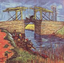
The other day I was talking to an artist in Edmonton.  He is the one who in 1980 taught me to keep track of my paintings with card files.  Here is a photo of one:

Using 5x8 inch cards, I take a photo of every painting and staple it to a card.  I number my paintings by year, month, and then 1,2,3 and so on, and I put that number in the upper right corner.
The name of the painting goes on next.  Sometimes it is a temporary working title, which can be changed later.  I put the size of the canvas, and the dimensions, and the medium used (i.e. acrylic, or oil, or whatever it is).

If I have varnished the painting, I jot that down. When I sign the painting, I note on the card where the painting is signed and whether I have used initials or my whole name.  On the back of the card, I record when I send it out on consignment, what gallery it went to and when.  If it is sold and I know who bought it, I note their name.

It sounds complicated, but it has worked well for me.  I have sent off many paintings over the years; the galleries aren't always good at documenting the ins and outs of inventory, so I make sure that I know.

Here is a link to the website of Douglas Haynes, who shared this piece of helpful advice with me:
http://www.dhaynes.com/


Sunday, March 18, 2012

Gauguin and Polynesia


Last Thursday I went with a friend to Seattle to see the  Gauguin & Polynesia exhibition.  We went on the train, and had a long pleasant afternoon there.

The Seattle Art Museum has done a beautiful job of hanging the show - the paintings are well spaced and lit, so that the colours shine brightly.  Gauguin said that he wanted the colour to vibrate like music and I felt that it does. It glows, with nothing strident or harsh or clashing.  The paintings aren't large, most 30 x 36 inches maximum.  As much as I don't think I would have liked the man, I do like the way he put down the paint.

If you look through images of his work, you see many self-portraits.  They are all done from the same angle, with his head facing to the right and his eyes looking sideways.  This is the way it has to be when you are doing self-portraits; it is awkward because you have to look in the mirror and at the same time  face your canvas.  This one that is in the show has a nice bit of yellow-orange on his shirt front, and a good dash of black below to heighten the other colours.